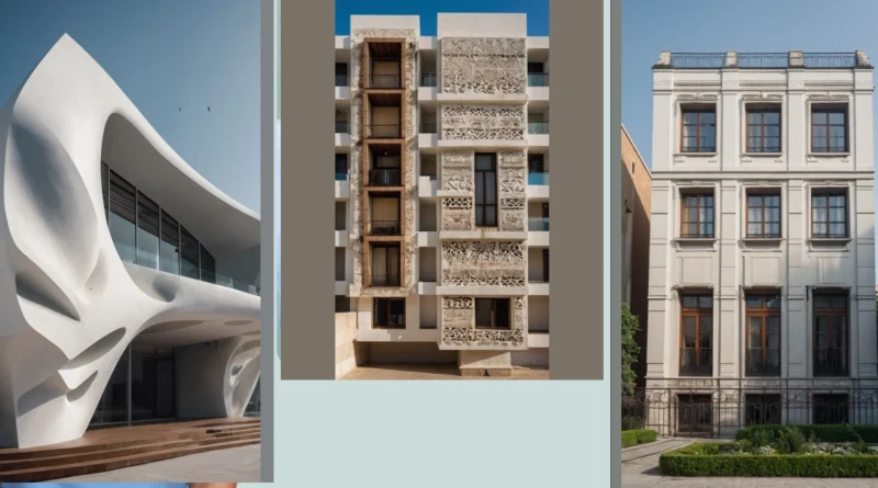
Facade Fiesta: 15 Eclectic Ideas for Every Building Type
Welcome, fellow aficionados of architecture! If you’ve ever gazed upon a building and marveled at its facade, then you’re in for a treat today. Just like fashion, the world of facade design is constantly evolving—a delightful fiesta of creativity! Get ready as we unveil 15 eclectic facade ideas that are perfect for hotels, schools, offices, and, of course, fabulous houses. Spoiler alert: It’s about to get fun and funky!
Let’s kick things off with modern designs that refuse to be boring. Sure, concrete can seem as exciting as watching grass grow, but throw in some flashy colors and unexpected geometries, and voilà! You’ve got an office building that shouts innovation. This modern take transforms concrete from a drab backdrop to a visual feast. The neighbors will be green with envy—who wouldn’t want a quirky building in their midst?
How about facades with curved designs? They’re not just for fancy audacious hotels anymore. We’re talking about schools where the students feel inspired and excited to learn. Imagine a classroom nestled within a flowing curve, designed to spark creativity! Curves can create a sense of movement, engaging passersby while making students feel like they’re part of something special. Let’s hear it for the curvy crowd!
Now, if you’re someone who enjoys the warm embrace of wood, you’re in luck! Wooden facades evoke a cozy atmosphere that can make any building feel inviting. Picture a library that looks like it belongs in a fairy tale thanks to its warm and rustic wooden facade. Or a mall that feels like a community hub instead of just a shopping center. Wood has this magical quality of drawing people together, like a social event that just happens to be under a roof.
And we cannot forget the classic charm of brick! While it’s tried-and-true, brick facades are still stepping up their game. Combining them with modern materials—including striking steel or sleek glass—can yield impressive results. Imagine a school that reflects its history and future simultaneously, blurring the lines between tradition and modernity! Brick is the versatile hero we didn’t know we needed!
So, whether you’re on the hunt for the perfect office space or dreaming about the ultimate house design, take a moment to appreciate these unique facades. They remind us that architecture is more than just function; it’s about expression, creativity, and the stories we tell through our built environment. Let’s toast to the amazing world of facade design!
—
#1 The Facelift of Facades
This building looks like it’s wearing a stylish outfit! Its “facade” is a fancy way of saying its outside design, and this one is super cool. It has a smooth, white finish, like a freshly painted canvas, and curves like a rollercoaster. Those big, black windows are like its eyes, watching over the world below. It’s definitely not a boring boxy building. It’s got its own unique personality, and it’s making a statement, just like your favorite outfit!
The way the building curves in and out is really interesting! Imagine you were a tiny ant crawling along the outside. You’d have to take lots of turns, climbing up and down little hills. That would be quite the adventure! It’s like the building is whispering a secret: “Don’t be afraid to think outside the box! Be bold and be different!” It seems like this building is a trendsetter, just like you!
#2 Shining a Light on Facade Architecture
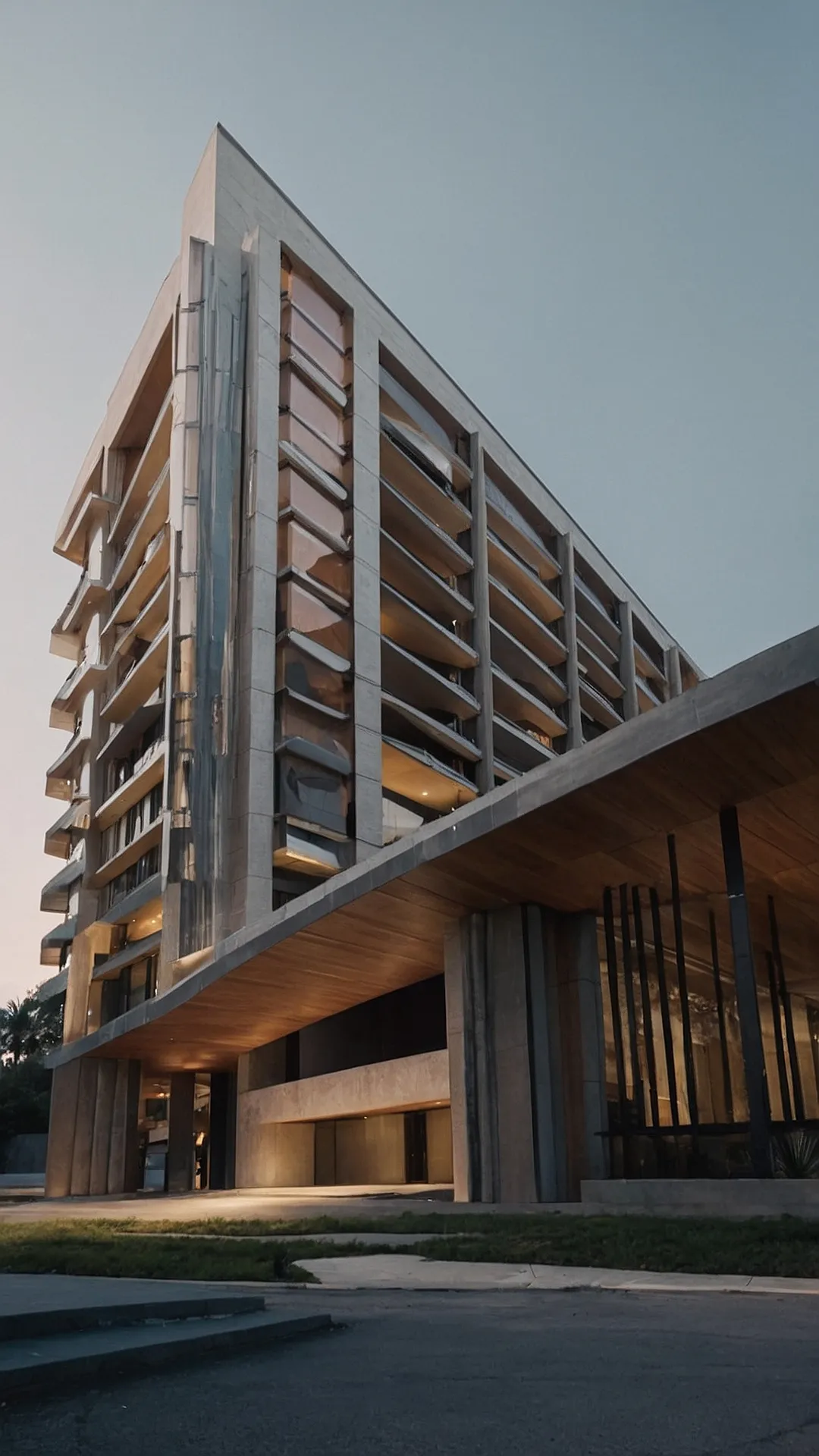
Imagine a building that looks like a giant Lego set, but instead of colourful bricks, it’s made of sleek, modern glass and concrete. That’s kind of what ‘facade architecture’ is all about! It’s like giving a building a fancy new outfit, with cool shapes and patterns that make it stand out from the crowd. It’s the art of making a building look super stylish from the outside, even if the inside is just a bunch of boring old rooms.
In this picture, we’re looking at a building with a facade that’s super sleek and modern. You can see how the different layers of glass and concrete create a really cool, geometric design. It’s like someone took a giant ruler and drew lines all over the building! Facade architecture is all about making buildings look interesting and unique, even if they’re just stacked up boxes. It’s like giving a building a little bit of personality, which can be pretty fun when you think about it.
#3 Face-Off!
This house is like a supermodel—all angles and sleek lines. It’s got a whole facade thing going on, which basically means the outside is super fancy and cool. Imagine walking up to this place, and instead of a boring old door, you get a giant window that looks like a giant, shimmering mirror. It’s like the house is putting on a show just for you!
And check out that pool! It’s like a giant, super-smooth puddle reflecting all the awesome architecture. It’s so calming and serene, you’d probably forget all about your homework and just want to chill there all day. Maybe even take a dip in the pool and pretend you’re a super-rich, sophisticated architect!
#4 Facelift Fantastic!
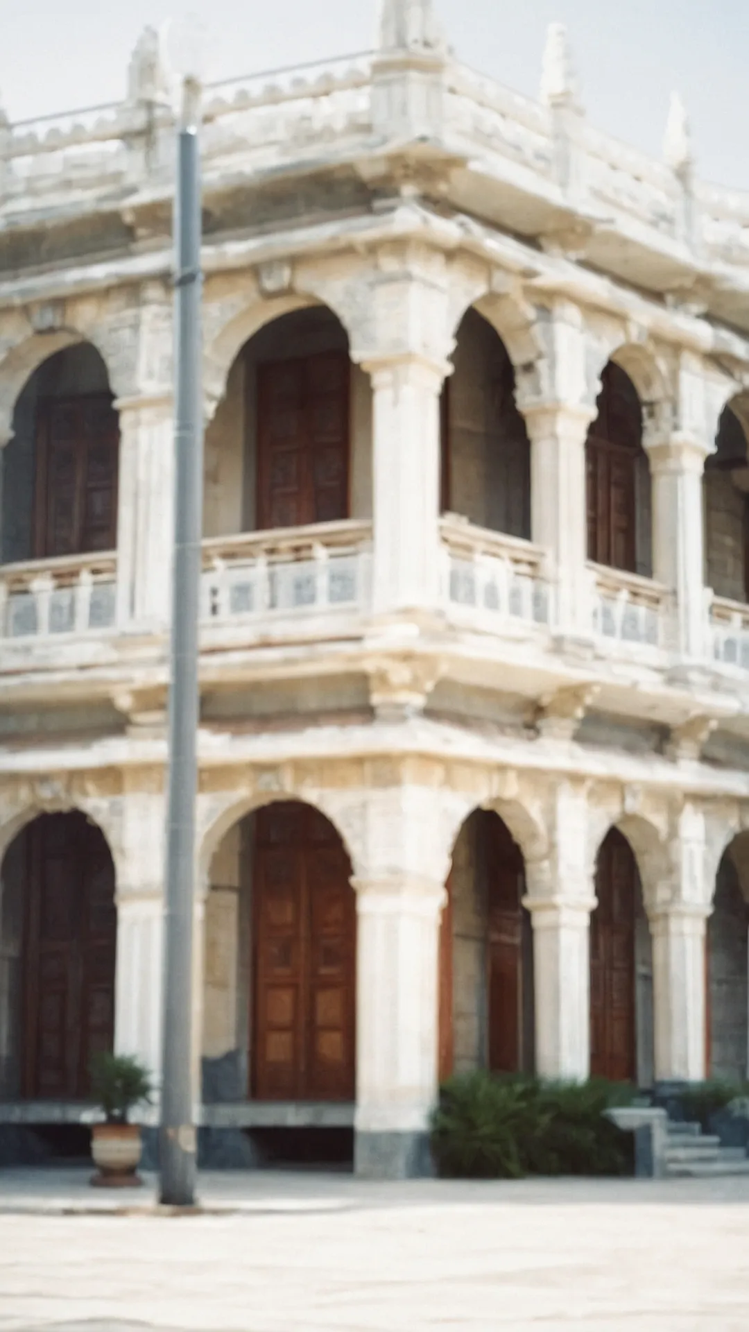
This building is like a fancy dress-up party for architecture! It’s got all the classic features: arches, columns, and even a little balcony. It looks like someone took a regular house and said, “Let’s give it some extra pizzazz!” The white walls make it feel clean and bright, and all the details, like the little decorations on the balcony, give it a really unique personality. You can almost picture people strolling around, enjoying the view from the balcony and admiring the beautiful facade.
This is a perfect example of “facade architecture,” which is basically the fancy face of a building. It’s the part that everyone sees and that gives the building its first impression. Like a person’s face, the facade can tell you a lot about the building’s style, history, and even its personality. So next time you see a cool building, remember, it’s all about that facade!
#5 Facade Frenzy
This building is like a fancy dress-up party for houses. It’s all about the facade, which is like the building’s outfit. Look at those symmetrical windows, they’re perfectly lined up, like a row of friends at a school dance. And that intricate design around each window? It’s like the fancy embroidery on a dress. This building knows how to make a statement, and it’s definitely not afraid to show off!
And speaking of statements, notice that the building’s facade is made of white plaster. This is a common technique in architecture called “facade architecture,” and it makes the building look sleek and modern, kind of like wearing a crisp white shirt. The way the light reflects off the white plaster is also pretty amazing, like a spotlight highlighting this building’s beauty. So, if you’re ever looking for a building that knows how to dress up, just remember this one – it’s the ultimate fashionista of the neighborhood!
#6 Curvy and Cool: A Building with a “Facade”
This building is like a giant Lego set, but instead of colorful bricks, it’s made of concrete and glass! You can see how the different pieces fit together to create the building’s “facade,” which is basically the fancy word for its outside look. It’s like a big puzzle that’s slowly coming together.
Right now, it looks kind of rough and unfinished, like a Lego project that’s missing some important parts. But imagine when all the windows are in and the walls are painted! It’ll be a masterpiece, like a giant building made of Legos, ready to stand tall and show off its amazing design. That’s what makes facade architecture so interesting – it’s all about how a building looks from the outside, and how the different parts work together to create something beautiful.
#7 Facade Fusion
This building is a total show-off! It’s like a big, grey, concrete puzzle with lots of balconies and windows. It looks like someone took a regular building and added some extra cool features to make it stand out. Imagine living there, you’d be the envy of the neighborhood with your modern and trendy apartment. The building is super cool, but also super mysterious. What’s hidden behind those windows? Are there secret passages or maybe even a giant slide that takes you down to the street? Who knows, maybe that’s why it’s called “facade” architecture—it’s all about making a great first impression.
The “facade” of this building is like a big, friendly face that says, “Hey! I’m cool and modern. Come on in!” It’s designed to impress you with its clean lines and interesting shapes. It’s like a cool, calm, and collected giant who just wants to make sure you feel welcome. The best part? It doesn’t have to hide its amazing features. It’s happy to show them off, just like a proud parent showing off their child’s artwork! And that’s what makes “facade” architecture so interesting—it’s all about making a statement.
#8 Geometry Eaten: A Building’s Tale
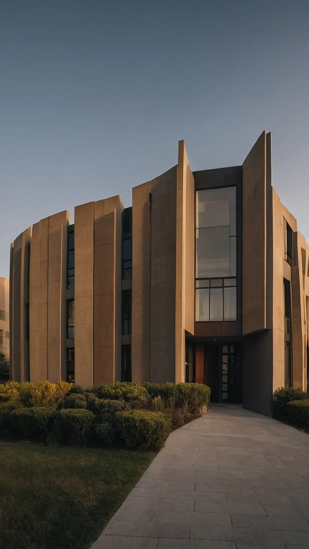
This building is like a giant game of Tetris! It’s got all these cool, rectangular shapes and lines that create a really interesting look. It’s like someone took a bunch of blocks and stacked them up in a really creative way, and it’s got this sleek, modern vibe. The big windows are like eyes, and the smooth, beige walls make it look like a super clean and polished building!
Facade architecture is basically the fancy way of saying “what the outside of a building looks like.” It’s really important because it’s the first thing you see when you look at a building. This building’s facade is kind of like a giant puzzle, and it’s a good example of how architects can use different shapes and materials to create a really cool and unique look. Think about it, if all buildings looked the same, that would be super boring, right? So, thanks to facade architecture, we get all sorts of interesting buildings to admire!
#9 Building With Style
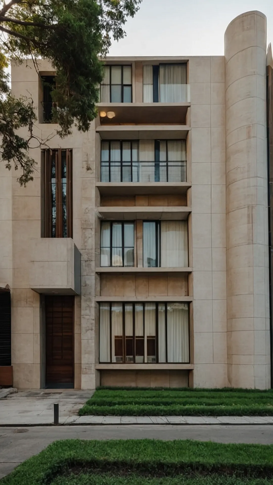
The building in this photo looks like it’s trying to impress everyone! It’s got a fancy facade, which is like the face of a building. Think of it as the building’s outfit, and this one’s definitely dressed to the nines. It’s got arches, columns, and fancy detailing that make it look super sophisticated. And it’s not just a plain beige building – it’s got a cool texture that looks like it’s been carved from stone! It’s like someone took a whole bunch of Lego blocks and built a miniature palace.
But here’s the funny part – it’s standing right next to a big, rocky mountain. It’s like the building is trying to outshine nature itself! It’s saying, “Hey mountain, I’m pretty cool too, you know?” And even though the mountain is huge and rugged, the building looks like it’s got its own unique charm. It’s like a fashion show where the mountain is wearing a comfy old sweater and the building is rocking a sharp suit!
#10 Facade Frenzy!
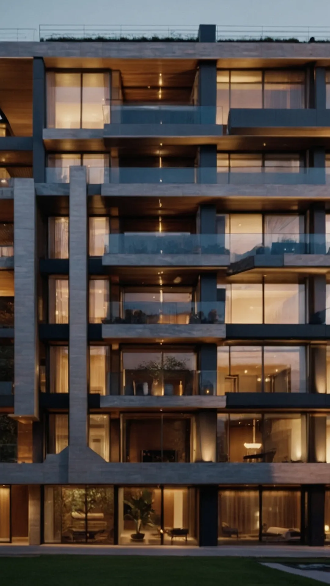
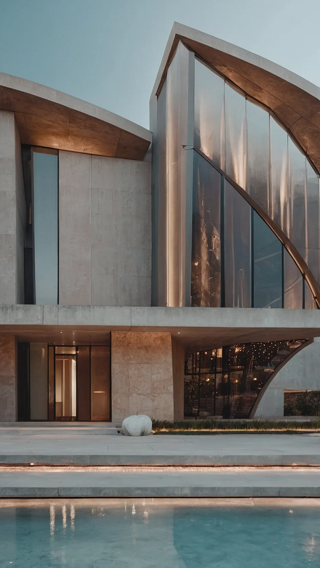
This building is like a giant puzzle! The architects took different shapes and materials and put them together to make something super cool. It’s kind of like the front of a building, but way more interesting. Imagine if you lived there, you could see the sky from your balcony and have a view of the whole city. It’s a good thing they used a lot of glass because you wouldn’t want to miss out on that view!
The way the building is designed makes you want to look closer. It’s like they took the coolest parts of a modern art museum and made them into a home! There’s wood, concrete, and glass – everything is super sleek and modern. This building isn’t just about being functional, it’s like a work of art that you can live in.
#11 The Facade’s Story
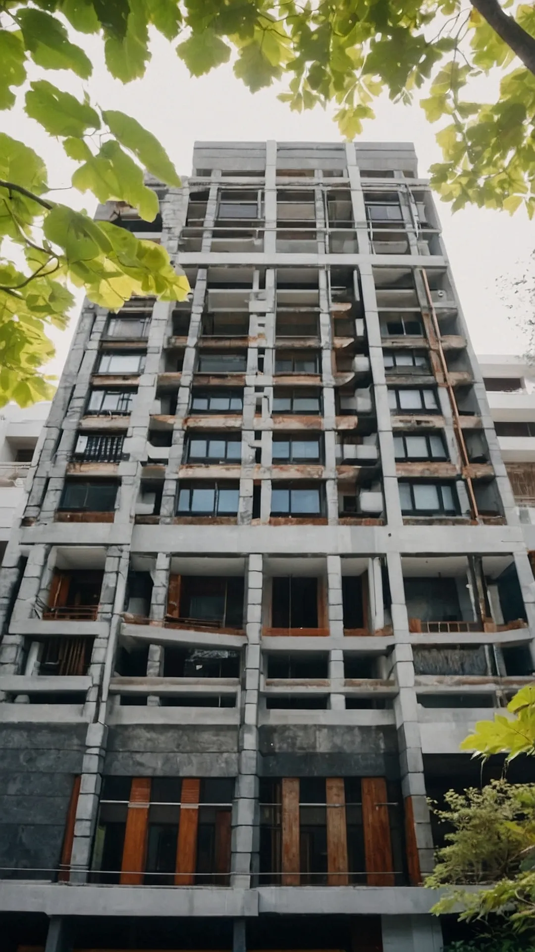
This building looks like it’s trying to escape from a game of Tetris! The long, flat walls and angled corners make it look like a giant puzzle piece. But don’t worry, it’s not going anywhere. This style of architecture is called “facade,” and it’s all about making the outside of a building look really cool and interesting. The architects probably got inspired by modern art or even some crazy video game. This building is definitely not boring, and it’s sure to catch your eye!
It’s kind of like if a giant Lego block decided to go to architecture school. It’s all about simple shapes and clean lines, and the way the building is built makes it look like it’s been carefully crafted. Even the way the light hits the walls makes it look super cool and unique. It’s a reminder that architecture can be fun and interesting, and you don’t have to have fancy details to make a building stand out from the crowd. This building definitely knows how to make a statement!
#12 Facade-tastic!
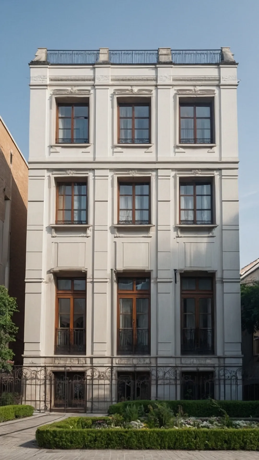
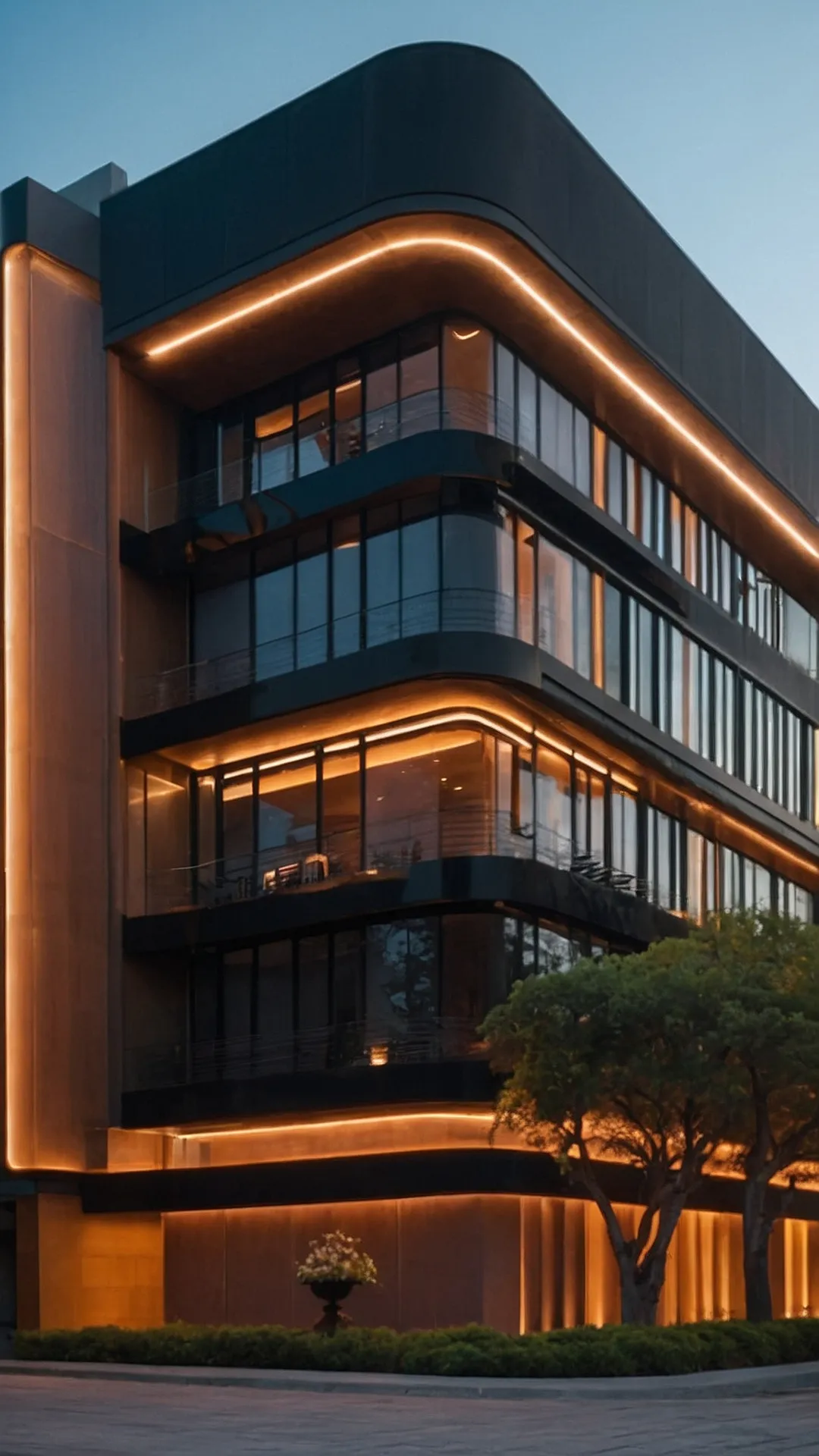
This building looks like it’s straight out of a sci-fi movie, doesn’t it? The sleek black lines and the glowing orange lights make it look like a futuristic spaceship landed right in the middle of town. This is what we call “facade architecture” – basically, it’s the art of making the outside of a building super stylish and eye-catching. It’s like giving a building a cool outfit!
The architects of this building used a bunch of different tricks to make it stand out. They used curved lines, big windows, and strategically placed lights to create a really dramatic and modern look. This kind of design is perfect for creating a building that people will remember and talk about. It’s like saying, “Hey, look at me, I’m different and awesome!”
#13 Facade Fantastic: This Building’s Got Style!
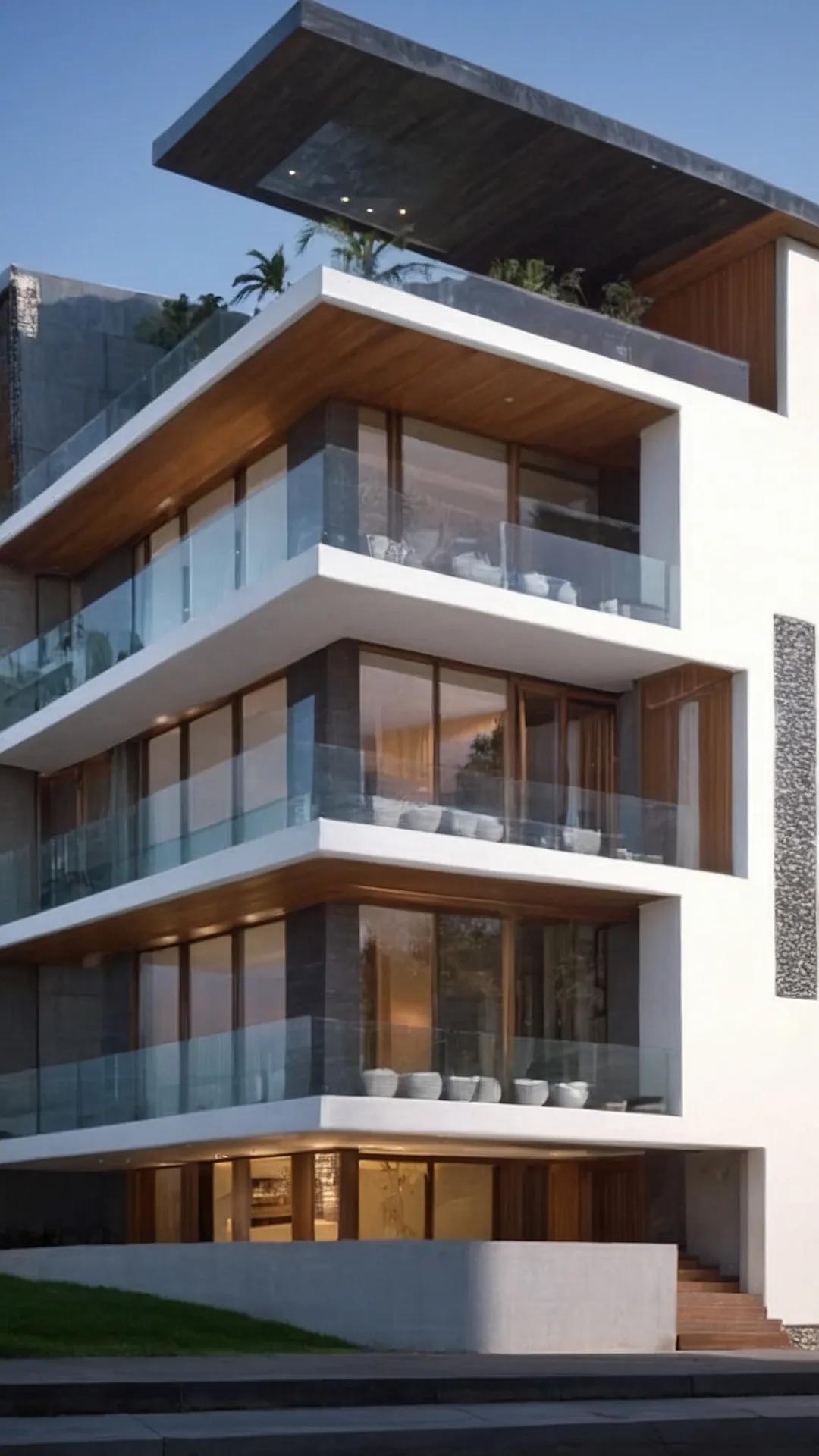
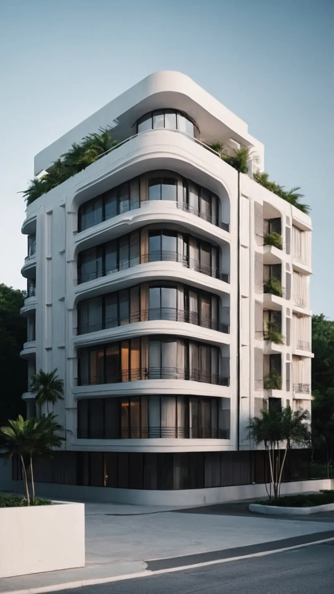
This building looks like it’s wearing a super cool, intricate outfit! Imagine walking up to this apartment building. The walls are covered in these awesome, swirling patterns, like someone took a giant cookie cutter and went wild! It’s like a 3D puzzle, and you just want to touch it and see how it all fits together. Maybe the designer was a little bit obsessed with swirls, but hey, it definitely makes this building stand out from the rest.
But here’s the thing: “Facade architecture” is kind of like a fancy word for how a building looks from the outside. It’s like a building’s costume! And this building’s costume is super unique and full of cool details. So, next time you see a building with a really cool facade, remember this picture and think about how the architect gave the building a special personality!
#14 Building Blocks: A Facade’s Journey
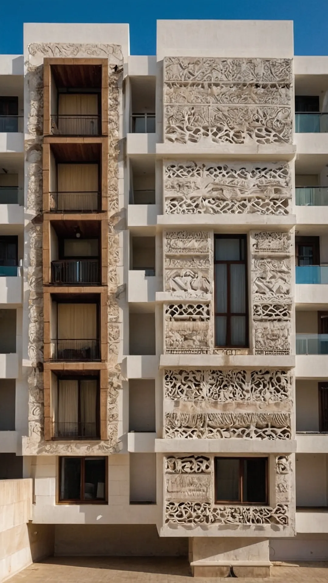
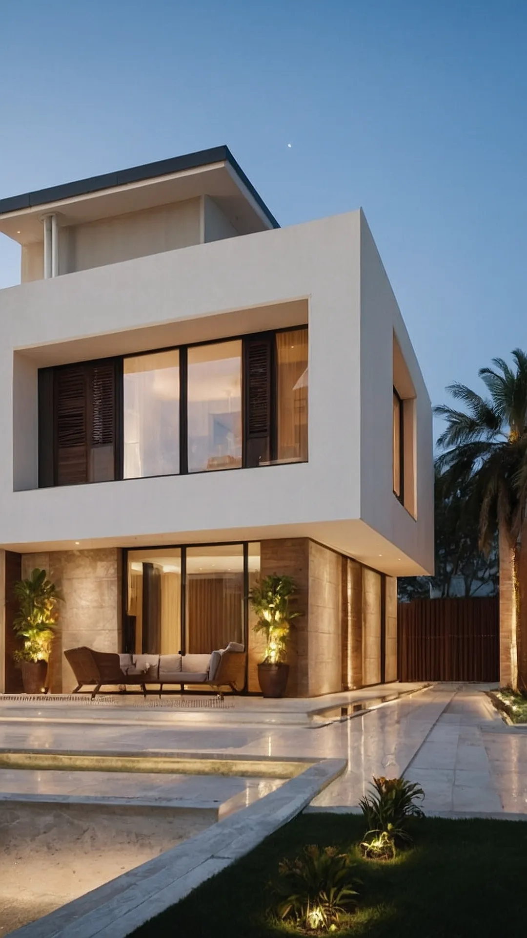
This house is like a giant, super cool Lego set! It’s all clean lines and sharp angles, with windows that look like they’re wearing fancy, modern sunglasses. You could totally imagine this place in a magazine with a model lounging by the pool, sipping on a smoothie.
The “facade” is the fancy word for the outside of a building, and this one is really something special. It’s like a minimalist masterpiece, with just the right amount of interesting details to make it pop. You might not even need to go inside to feel cool living here!
#15 Facade Fabulous: This House Is a Total Glass Act!
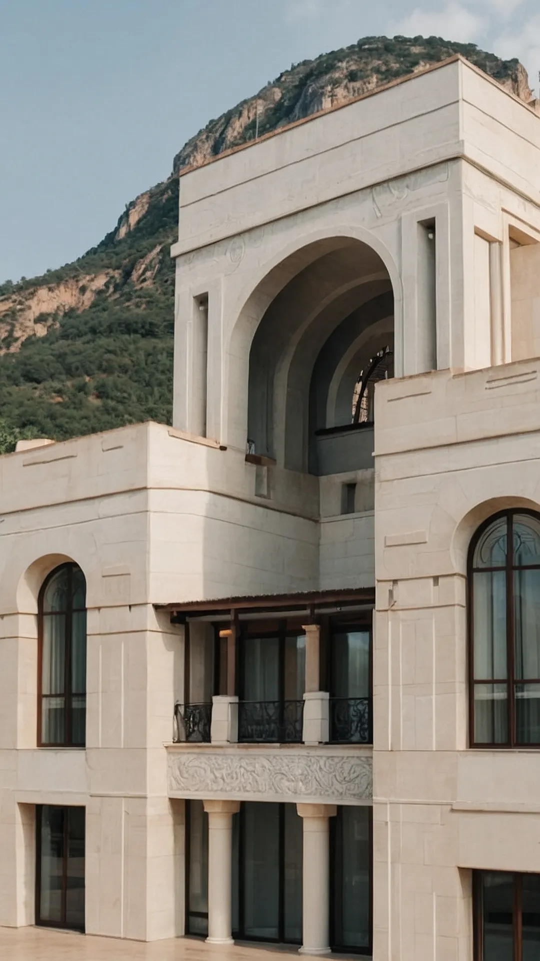
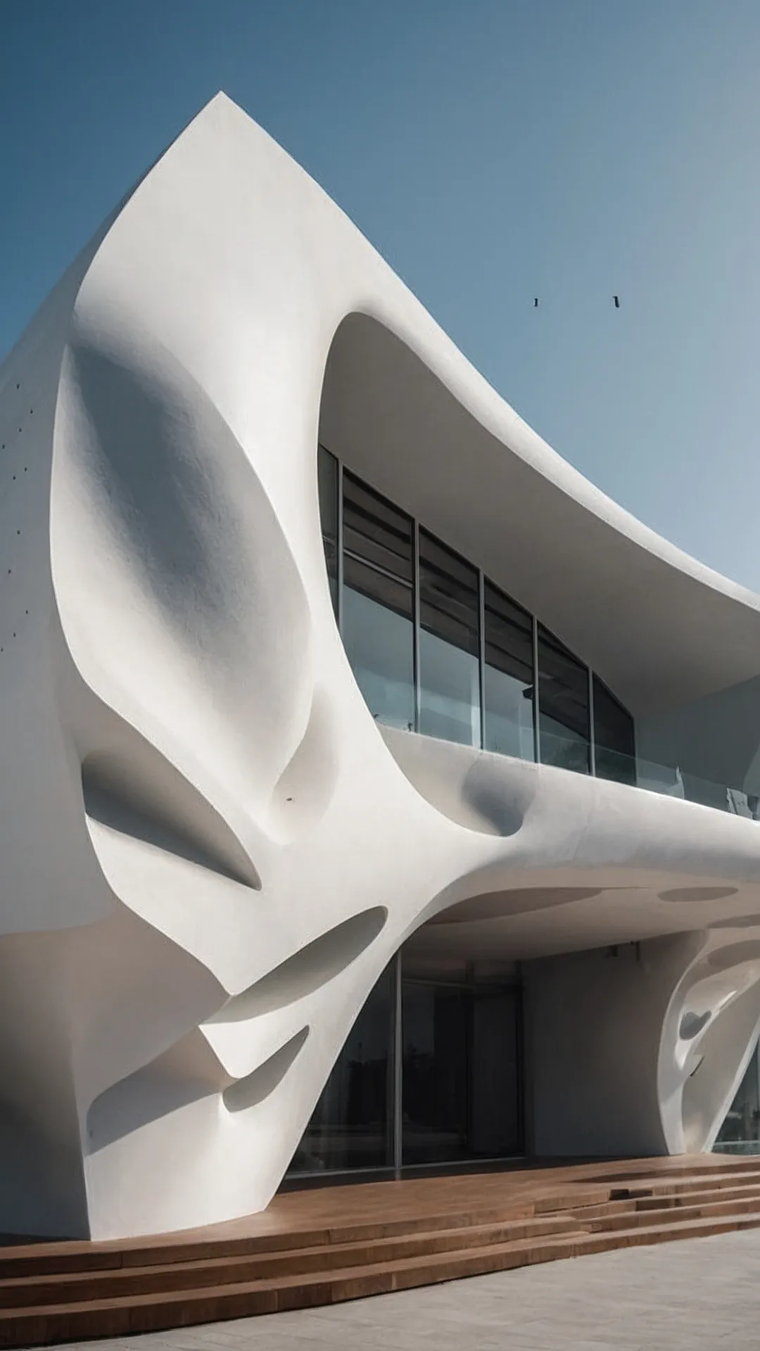
This building is like a giant marshmallow that got squished and then decided to become a house! It’s got all these cool, curvy shapes, and it looks like it might just swallow you whole if you get too close. Architects call this style “facade architecture,” which basically means the outside of the building is really, really interesting. It’s like a giant, white sculpture you can walk inside!
Imagine trying to build a house like this. You’d need a whole team of architects and engineers who know how to make walls that bend and curve like that. It must be super hard to make sure everything is perfectly balanced so the house doesn’t topple over! But hey, it’s worth the effort because it’s way more fun than a regular, boring house.
